
Ankooram — Identity Design
Creating a nurturing visual identity for Ankooram, focusing on growth and development.





GROWING YOUR Gardening Dreams SIDE BY SIDE
Lets Start with the process of
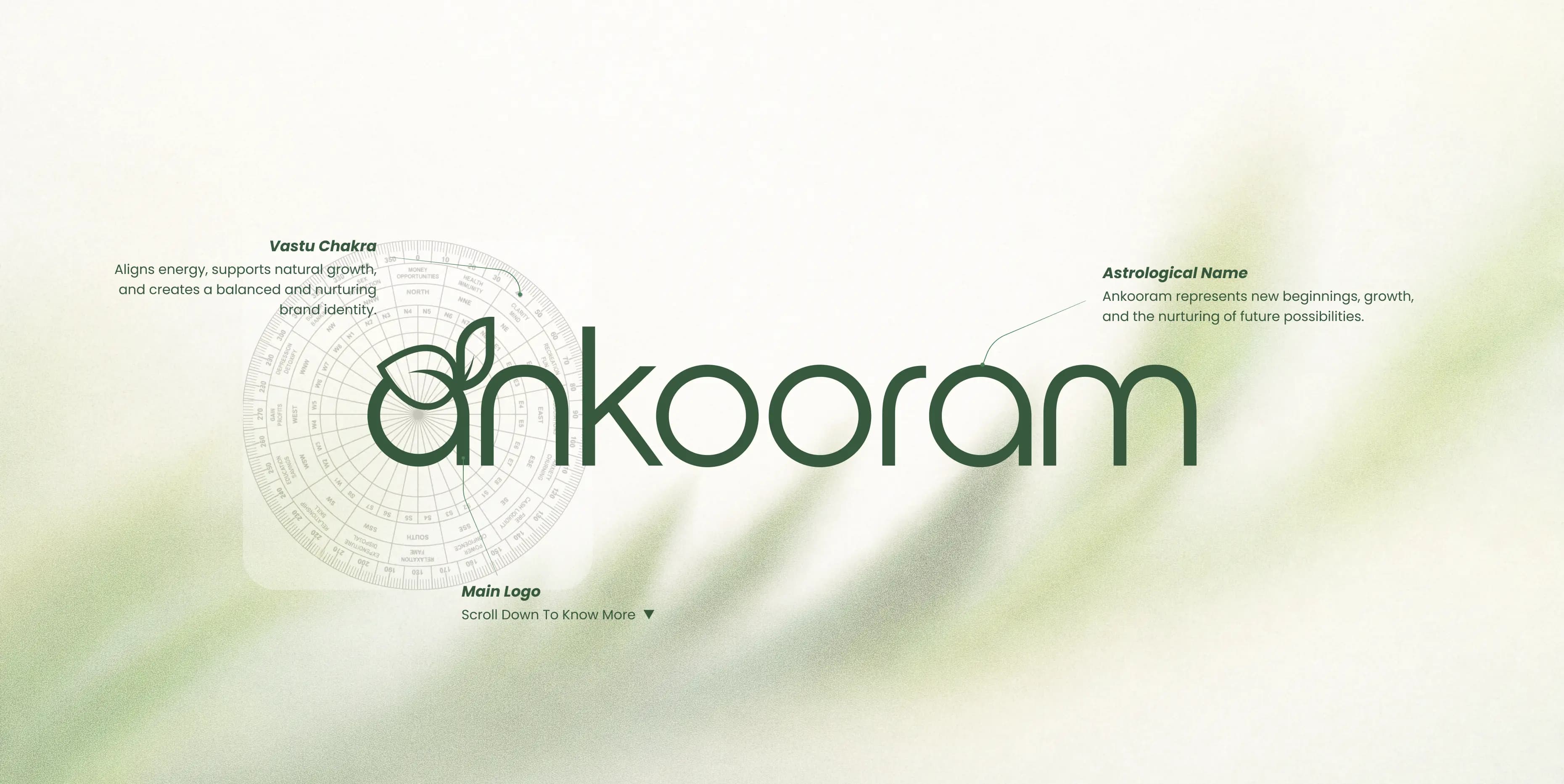
How we designed this Vastu Logo

About This Brand
Overview of brand

Logo & Brand Tagline
Identity & name energy
Nature & Elements
Pancha Bhuta element alignment

Colors & Energy
Auspicious palette Vastu color map
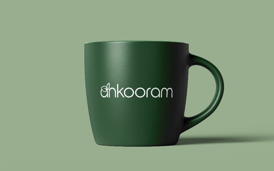
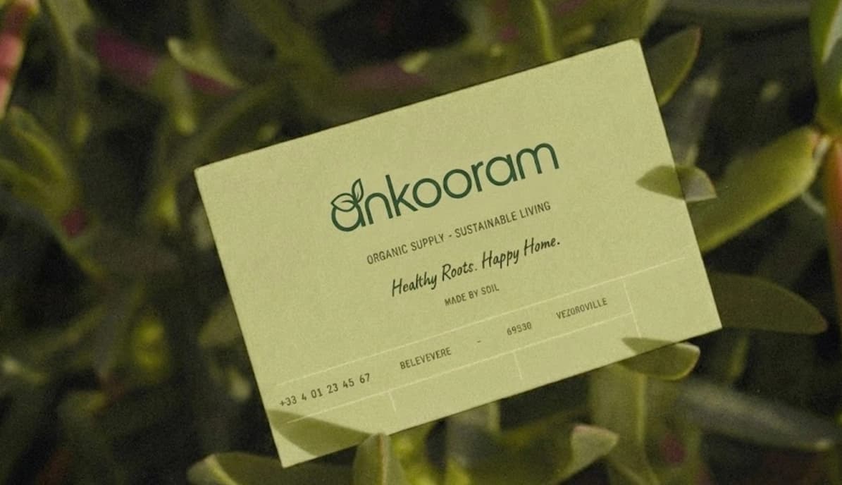
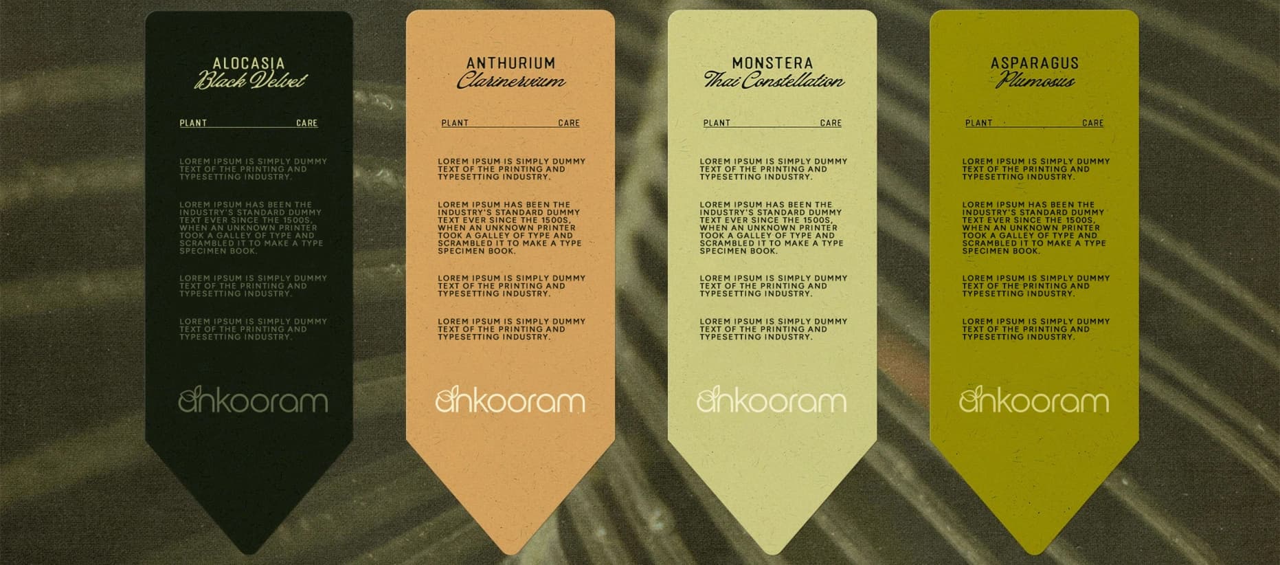
Branding & Mockups
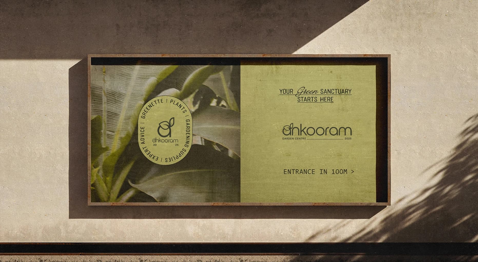
Final logo real-world applications

Overview of Brand
know about this brand

Ankooram is a brand rooted in the idea of new beginnings, growth, and nurturing potential. It represents the journey from a small seed to meaningful expansion, symbolizing transformation and progress.
From a Vastu perspective, the brand reflects growth (Jal + Prithvi) and life energy (Aakash), creating a calm yet evolving identity.
Nurturing beginnings into meaningful growth.

The name Ankooram
is derived from:
Meaning of brand name


The name Ankooram is derived from Sanskrit:
“Ankura” → Sprout / seed / new life
- Sprout = Water (growth)
- Root = Earth (stability)
The origin of growth and new possibilities
Elements based on Logo
Element alignment based on vastu
![[object Object]](/_next/static/immutable/media/earth.1ruaupjmzgnbp.svg)
![[object Object]](/_next/image?url=%2F_next%2Fstatic%2Fimmutable%2Fmedia%2Fwater.3rvlkn53x8fh_.webp&w=1920&q=75)
Auspicious Palette according to Vastu
Color palette based on vastu


Gradient Color 1:
 37593E
RGB: 100, 81, 191
CMYK: 48%, 58%, 0%, 25%
Why these colors?
The color deep natural green, is closely aligned with the Prithvi (Earth) and Vriksha (Plant) elements in Vastu Shastra. In Vastu, green represents growth, renewal, balance, and life energy—all of which resonate deeply with the essence of Ankooram, meaning “new beginnings” or “sprout.”
Mockup Designs


Generate your Free Kundali instantly and explore your birth chart.