Brightup — Digital Experience
A bright and energetic design system for Brightup to enhance user engagement.
Lets Start with the process of
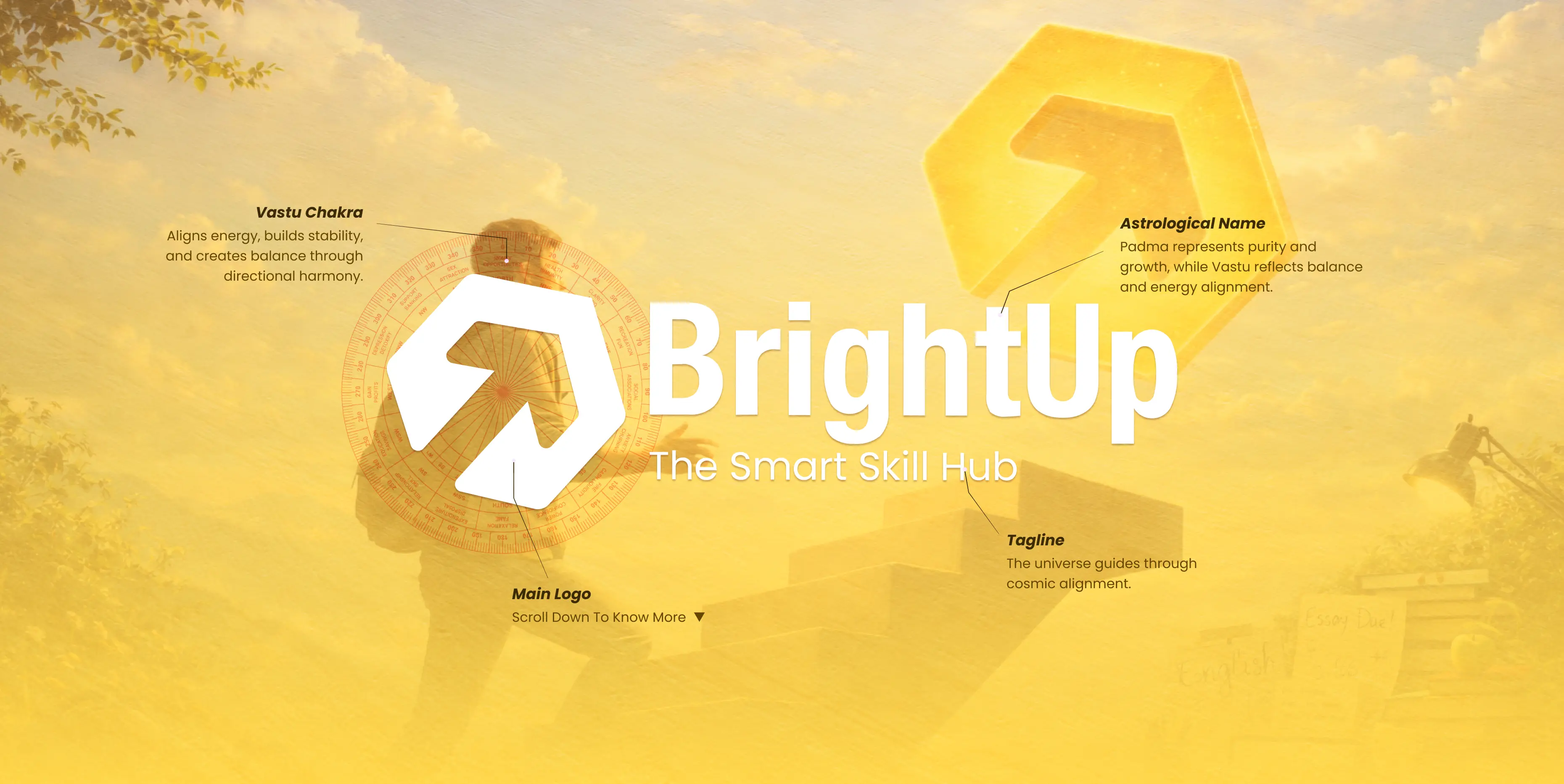
How we designed this Vastu Logo
About This Brand
Overview of brand
Logo & Brand Tagline
Identity & name energy
Nature & Elements
Pancha Bhuta element alignment

Colors & Energy
Auspicious palette Vastu color map
Shapes & Symbols
Sacred geometry symbol meaning
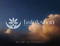
Branding & Mockups
Final logo real-world applications

Overview of Brand
know about this brand


BrightUp is an English learning institute dedicated to improving communication skills, confidence, and global language proficiency. It helps students and professionals enhance their spoken English, master conversation skills, and prepare for exams like IELTS.
The brand represents growth, clarity, and confidence, guiding learners from hesitation to fluent expression. BrightUp focuses on practical learning, real-life communication, and building strong language foundations for global opportunities.
Building confidence through English communication and real-world learning.
The name Bright Up is derived from:
Meaning of brand name
Icon Symbolizes the meaning of Bright Up
Meaning of Brightrepresents clarity, knowledge, and illumination—helping individuals gain the right skills and understanding.

Meaning of Upsymbolizes growth, progress, and moving forward toward better opportunities.
Elements based on Logo
Element alignment based on vastu
![[object Object]](/_next/image?url=%2F_next%2Fstatic%2Fimmutable%2Fmedia%2Fair.15u49q05lubk1.webp&w=1080&q=75)
![[object Object]](/_next/image?url=%2F_next%2Fstatic%2Fimmutable%2Fmedia%2Fwater.0r_ij7vcpxdoz.webp&w=1080&q=75)
![[object Object]](/_next/image?url=%2F_next%2Fstatic%2Fimmutable%2Fmedia%2Fearth.0ep3ku-i9jtfp.webp&w=1080&q=75)
Auspicious Palette according to Vastu
Color palette based on vastu
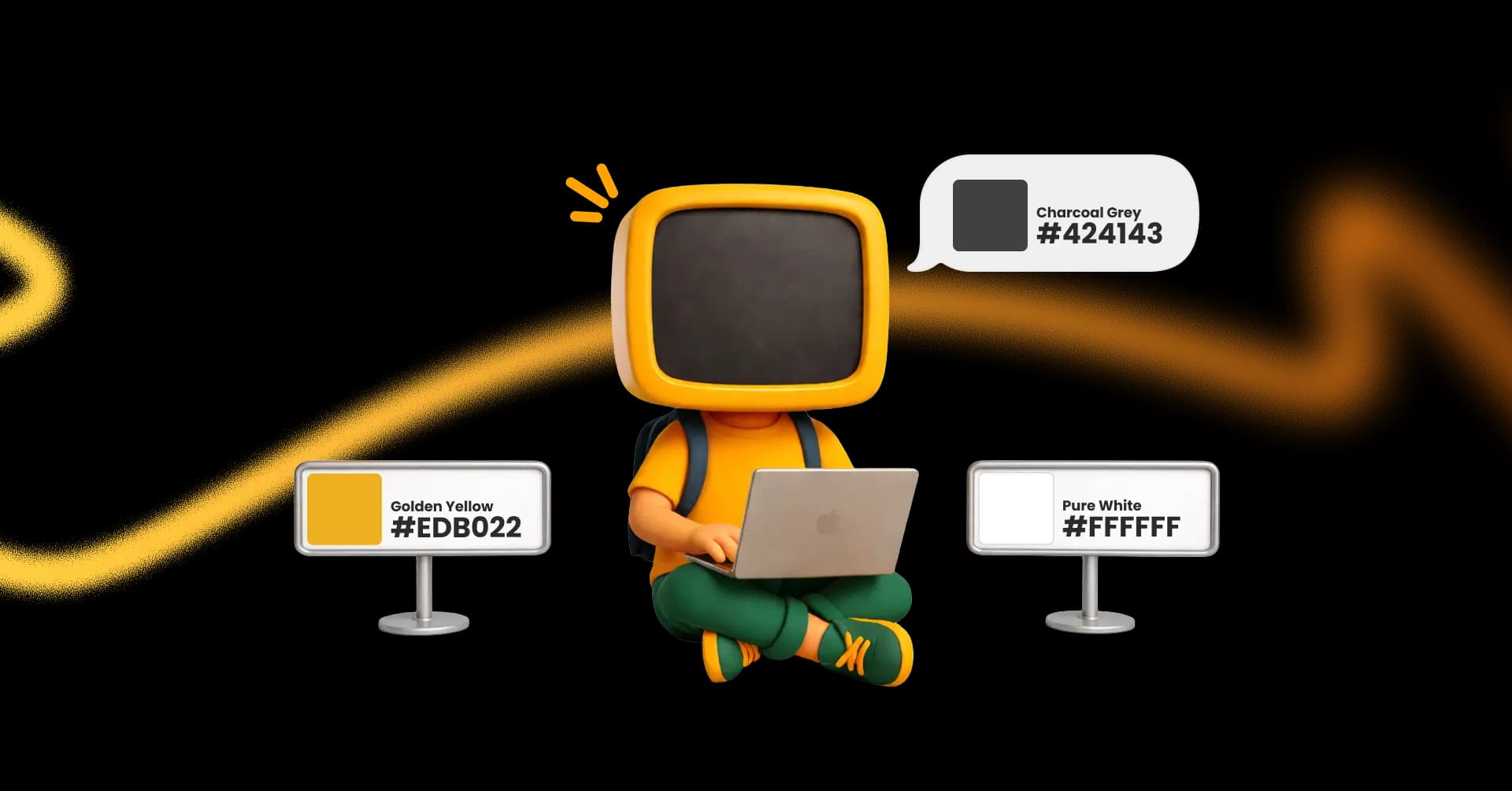
Auspicious Shapes & Symbols according to Vastu.
Shapes based on vastu
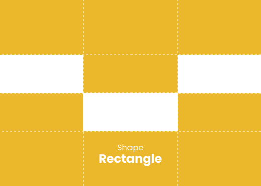
Rectangle
Represents stability, structure, and a strong foundation, creating a sense of balance and trust in the brand.
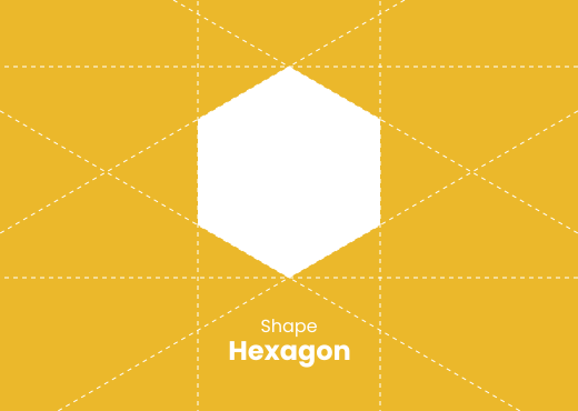
Hexagon
Symbolizes harmony, efficiency, and balanced growth, often seen as a form that connects strength with smooth energy flow.
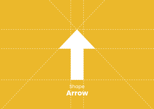
Arrow
Represents direction, progress, and forward movement, guiding the brand toward growth and higher goals.
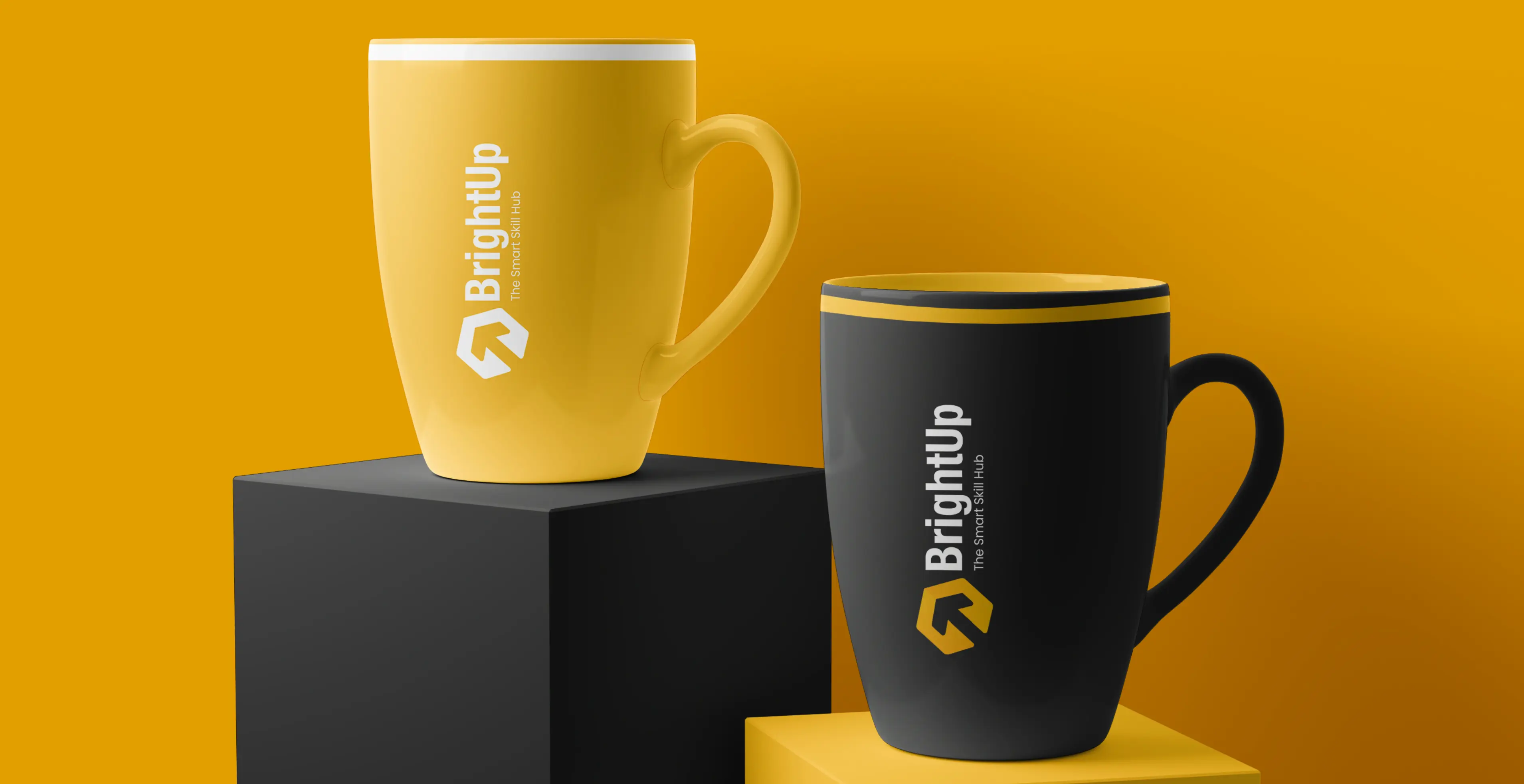
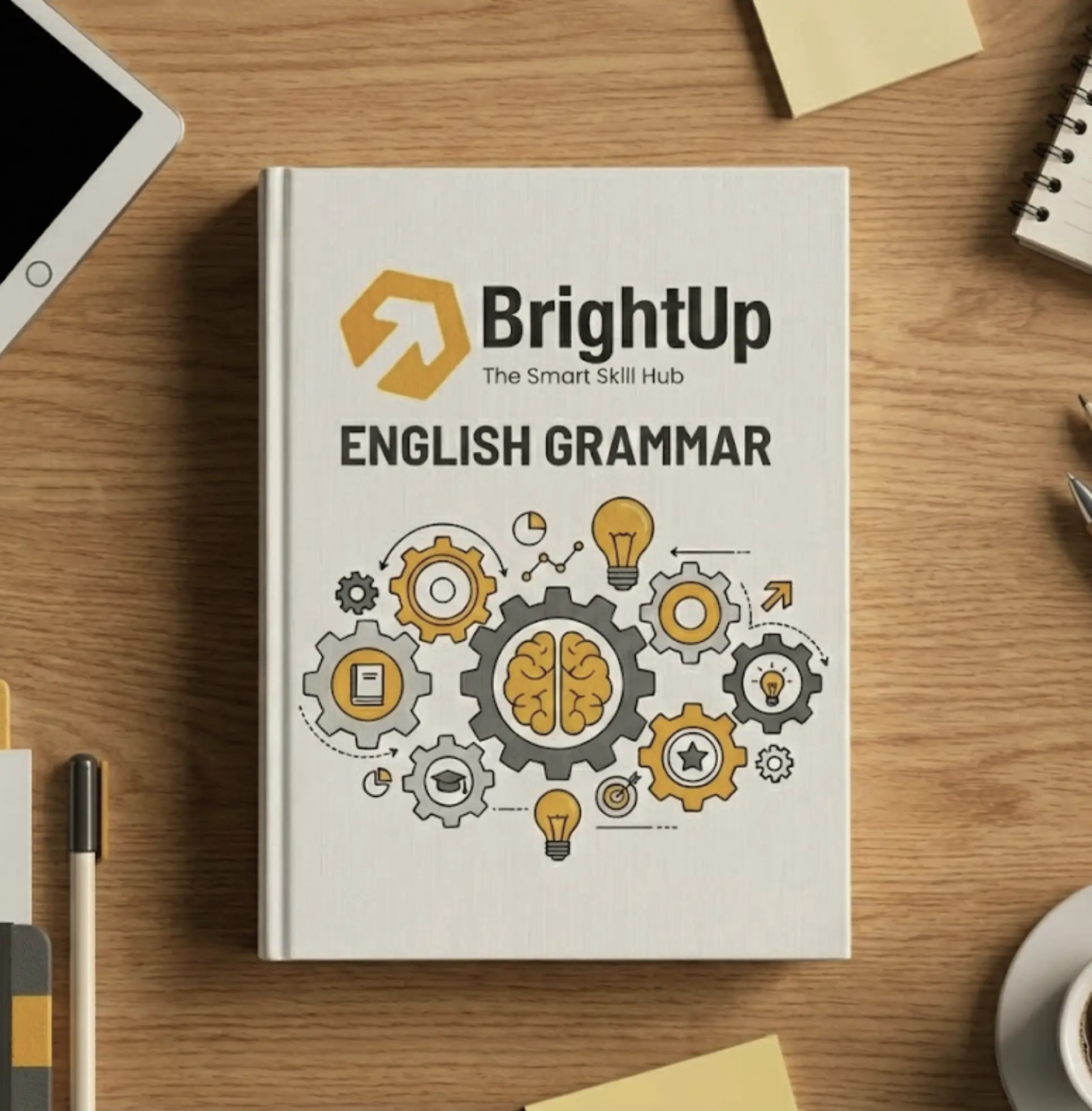
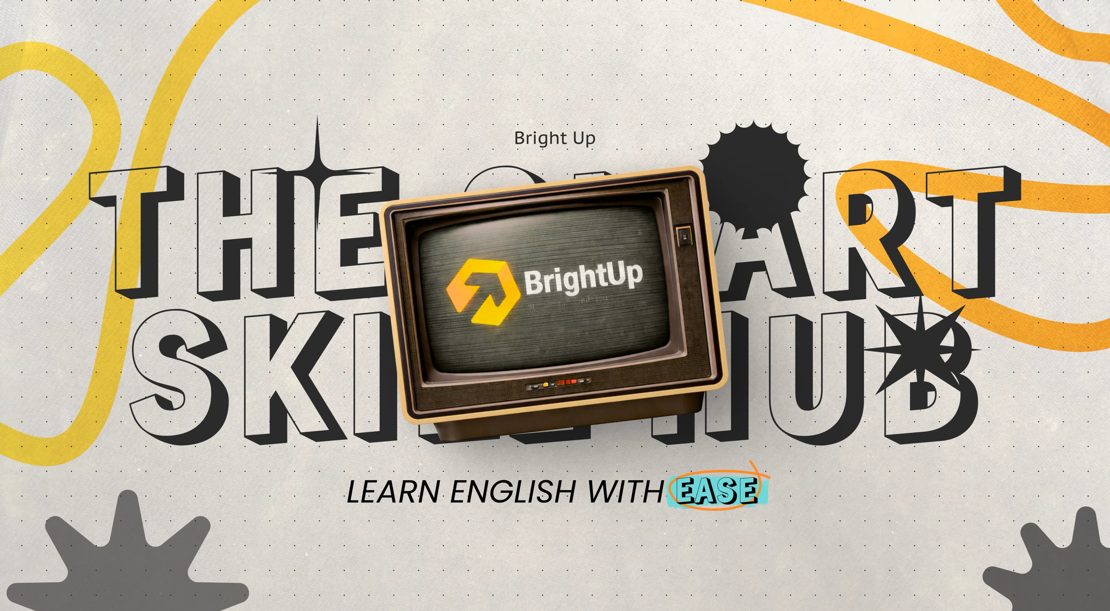
Mockup Designs