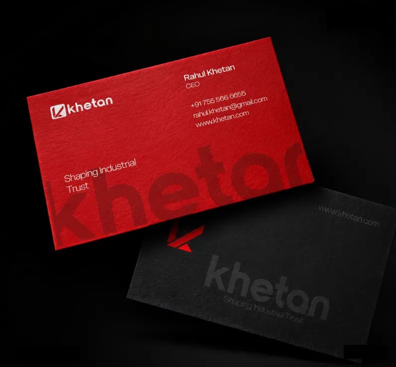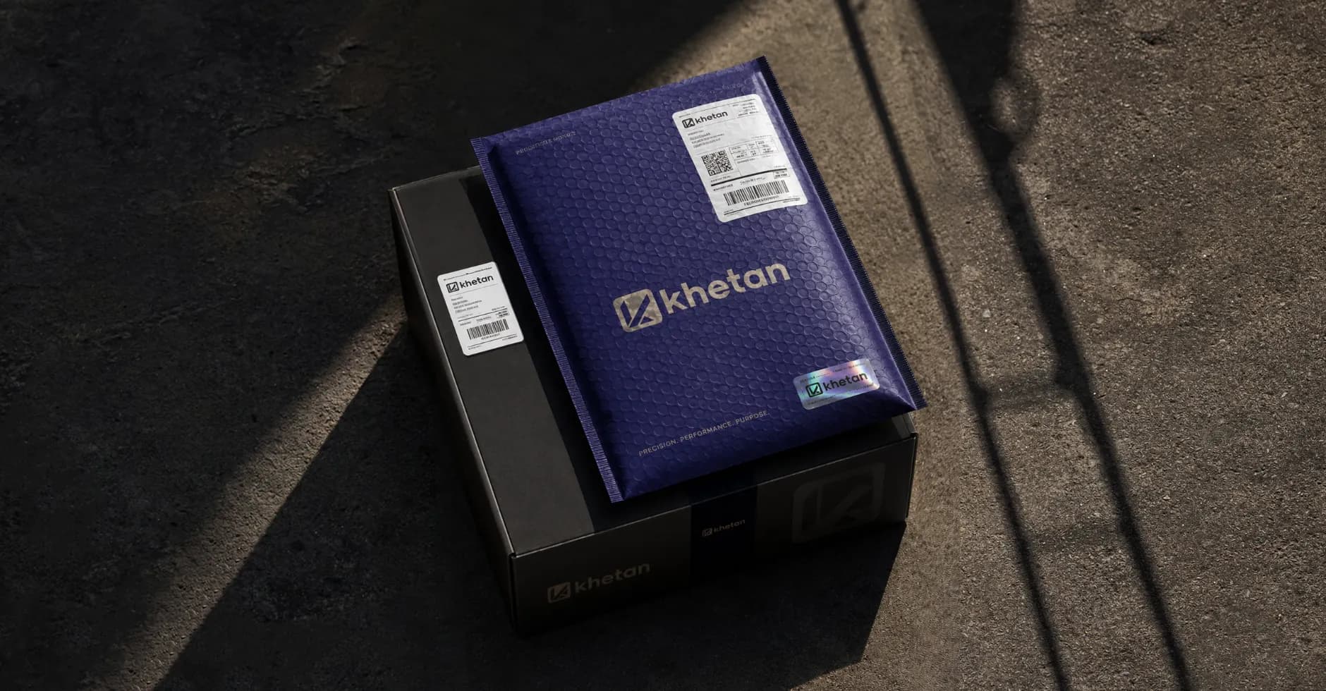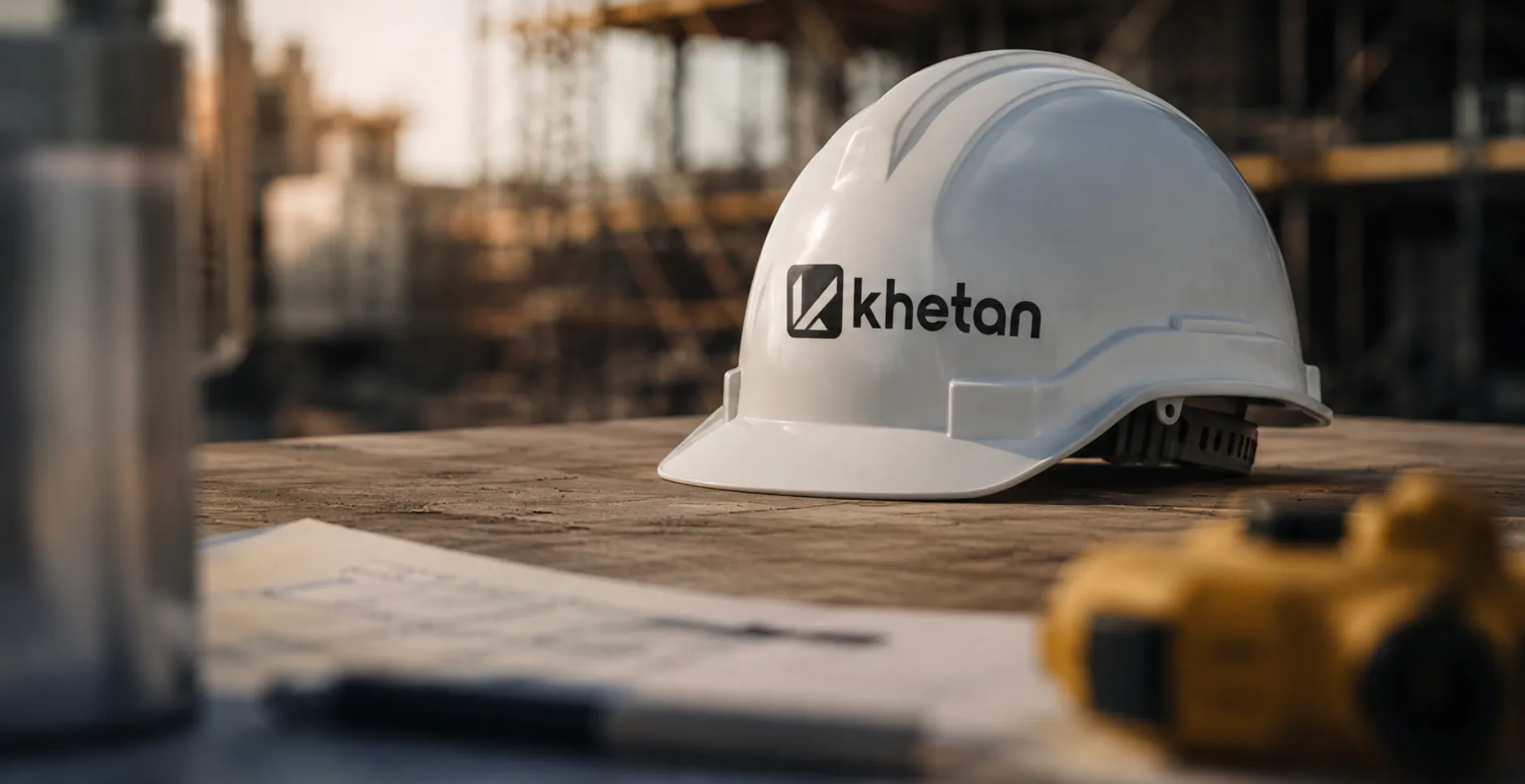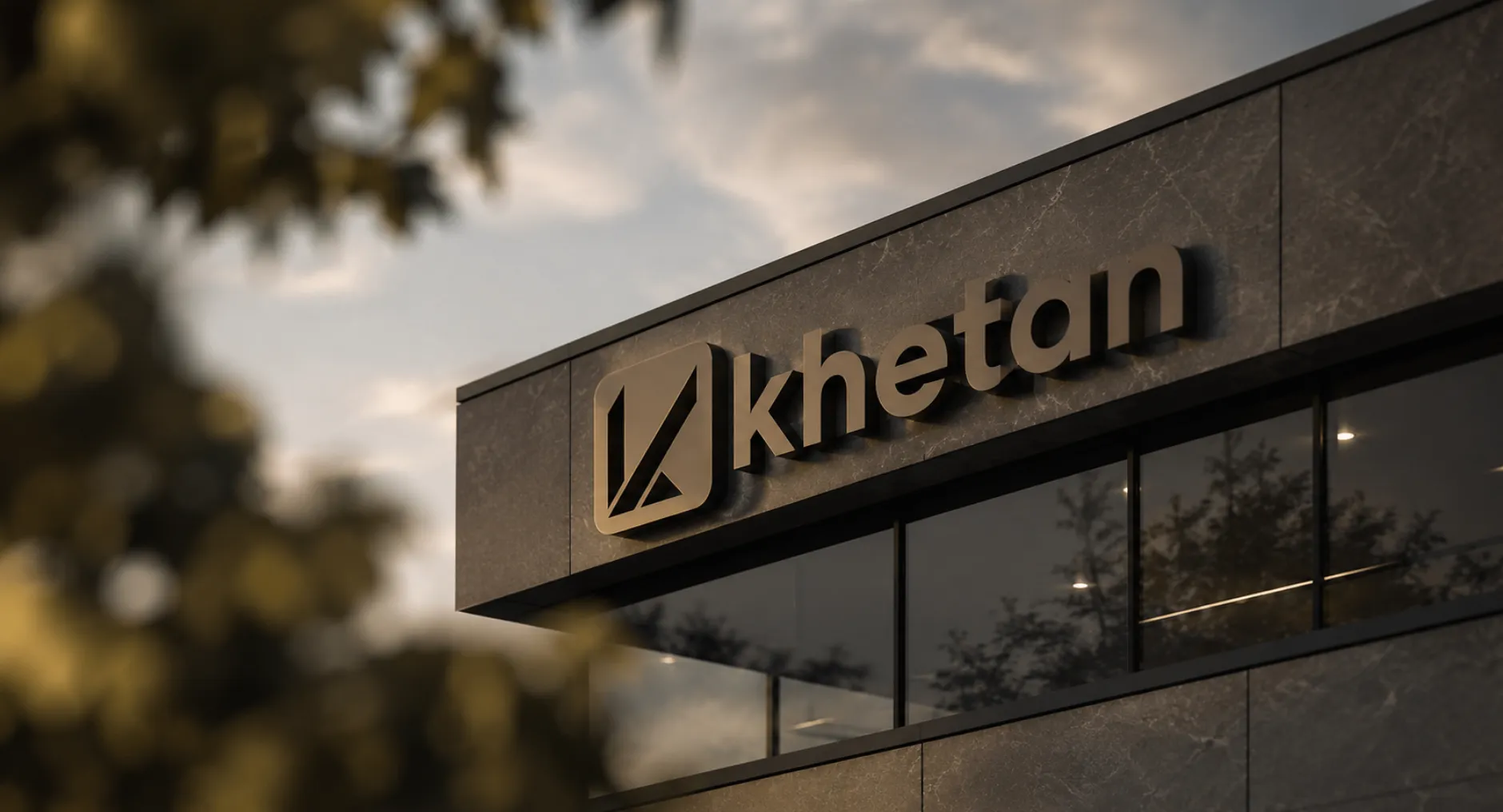
Khetan — Architectural Branding
A sophisticated brand identity for Khetan, reflecting precision and creativity.
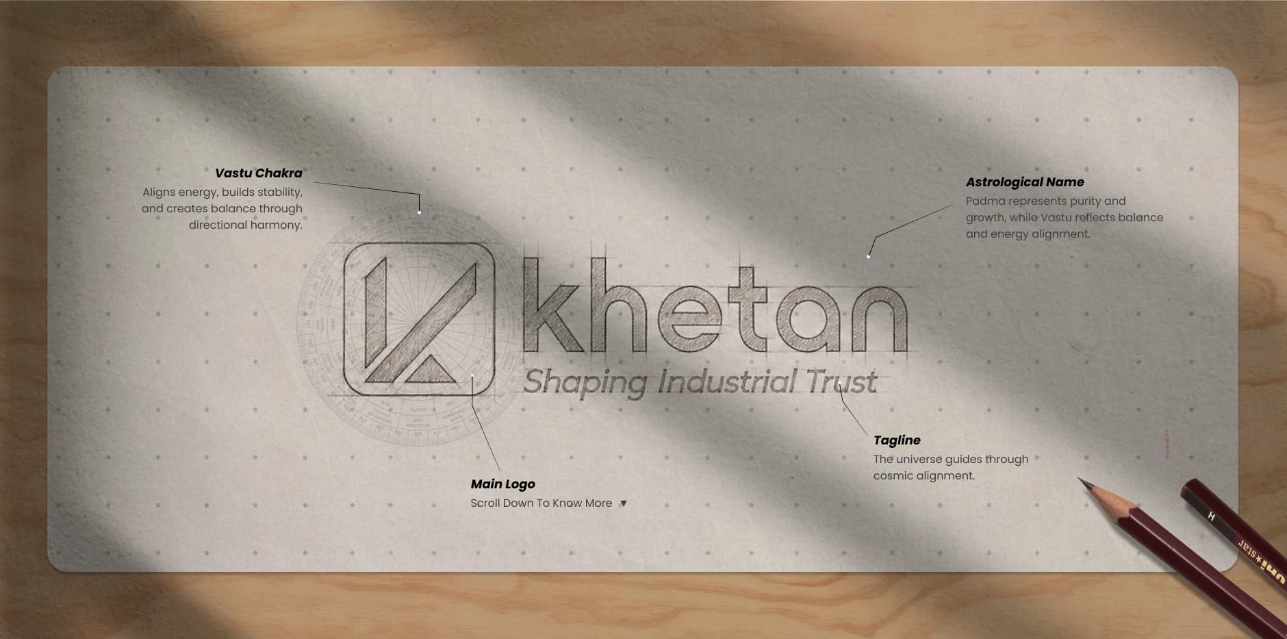
Lets Start with the process of
How we designed this Vastu Logo
About This Brand
Overview of brand

Logo & Brand Tagline
Identity & name energy
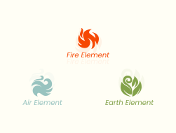
Nature & Elements
Pancha Bhuta element alignment
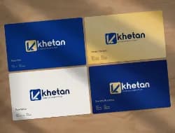
Colors & Energy
Auspicious palette Vastu color map

Shapes & Symbols
Sacred geometry symbol meaning
Branding & Mockups
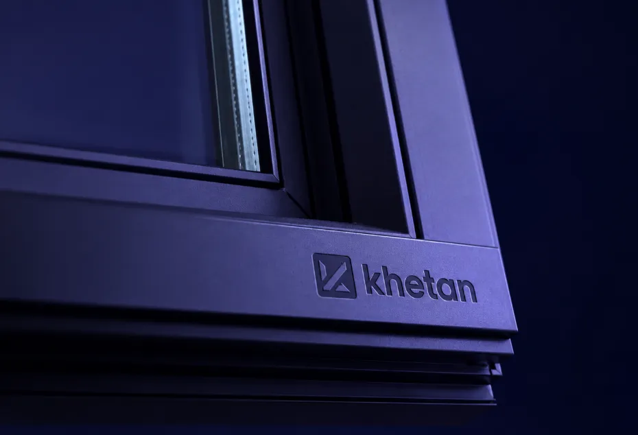
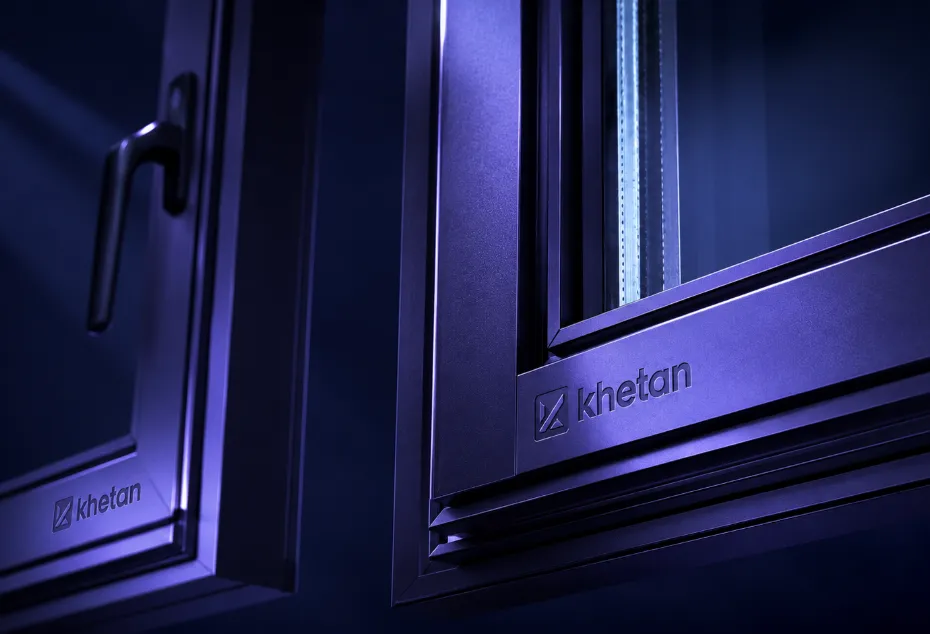
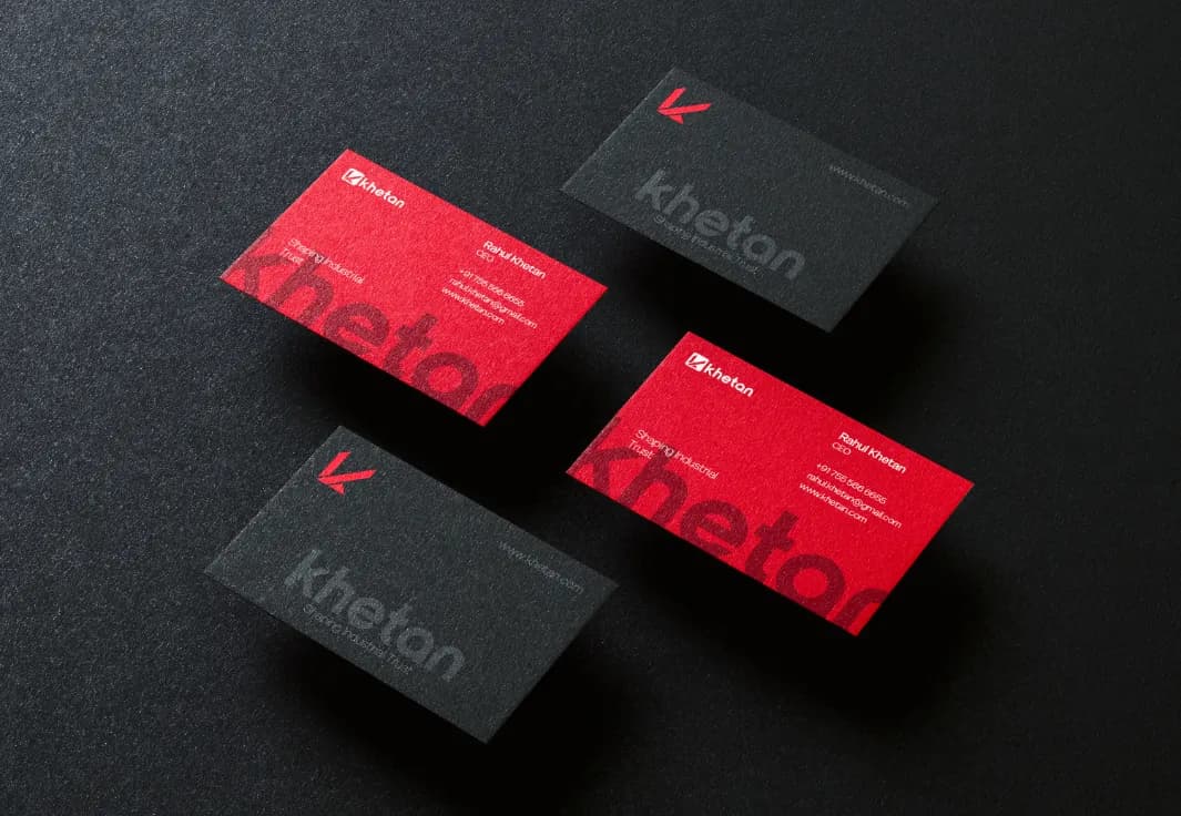
Final logo real-world applications
Overview of Brand
know about this brand


Khetan is an architectural practice known for precise planning and creative, purposeful design. Its work pairs technical discipline with an eye for form — spaces that are carefully measured and thoughtfully made.
The identity is built on the golden ratio. Its mark is drawn from proportioned triangles, the Vastu symbol of fire, growth and progress, and its structure from the rectangle, the symbol of stability and a strong foundation — so the brand reads as both ambitious and dependable.
Precision in every line, creativity in every space.
The name Khetan is derived from:
Meaning of brand name

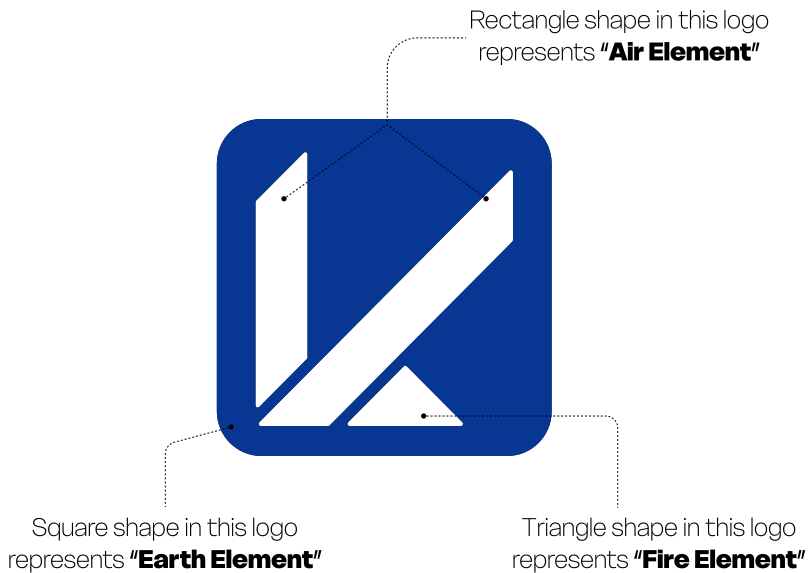
Elements based on Logo
Element alignment based on vastu
![[object Object]](/_next/image?url=%2F_next%2Fstatic%2Fimmutable%2Fmedia%2Fair.3b26kadabuu8t.webp&w=828&q=75)
![[object Object]](/_next/static/immutable/media/fire.0zq_6uw8bnf0e.svg)
![[object Object]](/_next/image?url=%2F_next%2Fstatic%2Fimmutable%2Fmedia%2Fearth.1g5eq49tczfz3.webp&w=750&q=75)
Auspicious Palette according to Vastu
Element alignment based on vastu
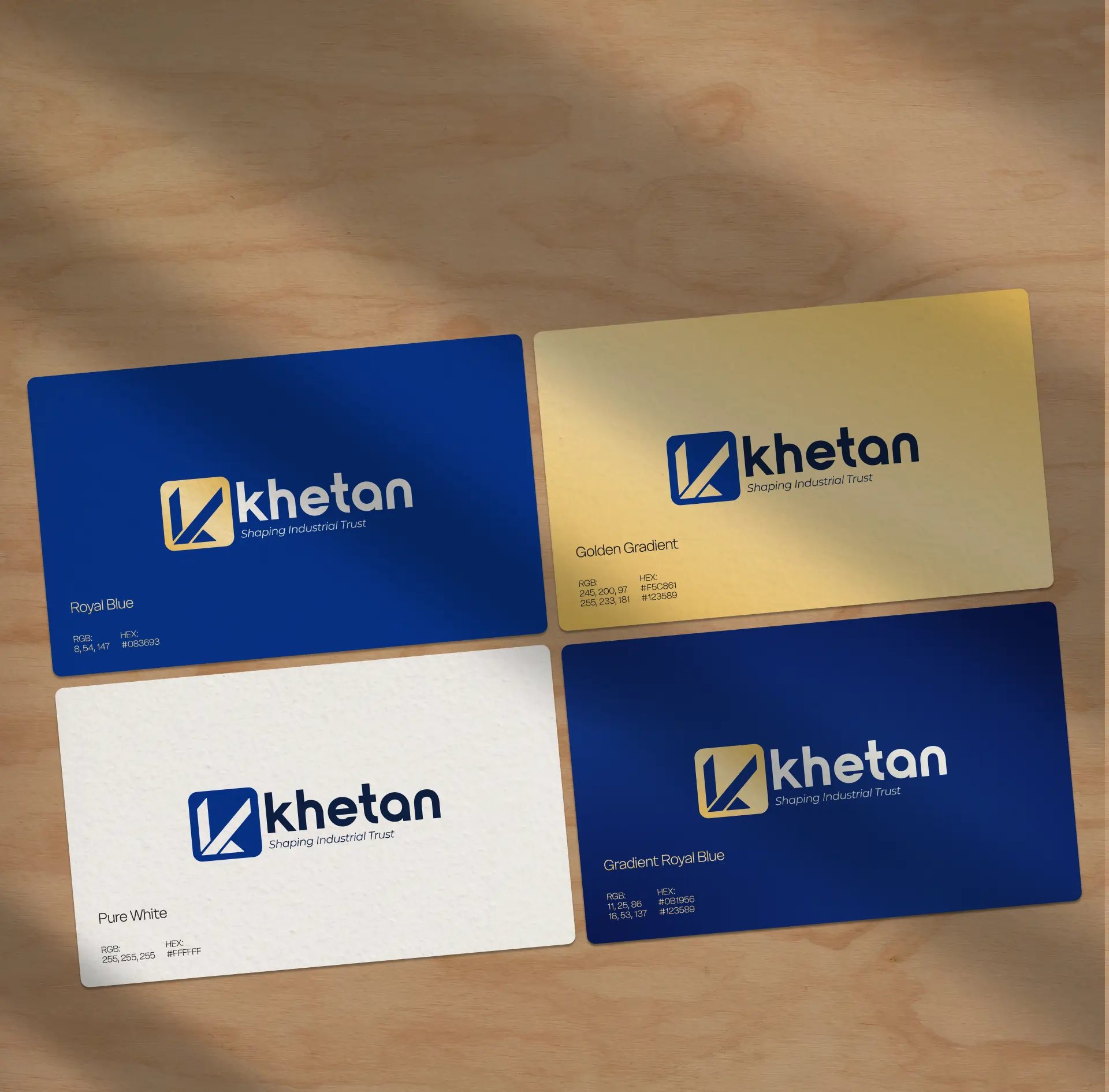
Auspicious Shapes & Symbols according to Vastu.
Element alignment based on vastu
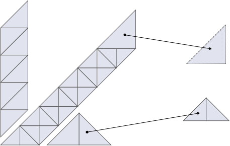
v2.
Khetan Logo Icon in (Golden Ratio-Triangles)
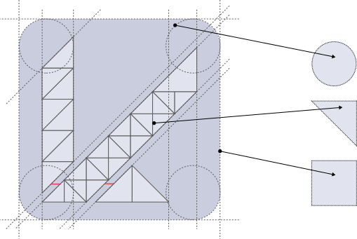
v3.
Khetan Logo in (Golden Ratio)

Triangle
Shape Triangle Represents, Fire Element, Growth & Progress

Rectangle
Shape Rectangle represents, AIr element

Square
Represents stability, structure, and a strong foundation, creating a sense of balance and trust in the brand.
Mockup Designs